Your users are not sitting at a desk anymore.
They’re browsing, searching, and buying — all from their phones.
If your digital product isn’t built for mobile first, you’re already behind.
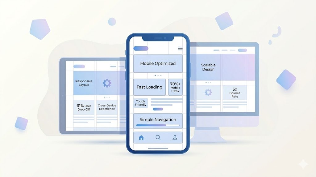
70%+
of traffic now comes from mobile devices
61%
of users won’t return to a mobile-unfriendly site
5x
higher bounce rate on websites with poor mobile experience
What is mobile-first development?
It means designing and building your product for mobile screens first, then scaling up for larger devices.
Not the other way around.
Element 01
Responsive design from the start
Layouts adapt seamlessly across all screen sizes.
Element 02
Optimized performance
Mobile users expect fast loading — even on slower networks.
Element 03
Touch-friendly interfaces
Buttons, menus, and interactions should be easy to use with fingers.
Element 04
Minimal and focused design
Less clutter = better usability on small screens.
Element 05
Prioritized content
Only the most important information is shown first.
Element 06
Cross-device consistency
Users should get the same experience across phone, tablet, and desktop.
“If your mobile experience fails, your entire digital strategy fails.”
Desktop-first vs Mobile-first
Desktop-first
- Shrinks content later
- Often breaks layouts
- Slower on mobile
Mobile-first
- Built for real users
- Fast and optimized
- Scales beautifully
The impact on your business
A strong mobile experience leads to:
- Higher engagement
- Lower bounce rates
- More conversions
So, how does your website perform on a phone?
Open your site right now on mobile.
If it feels slow, crowded, or hard to navigate —
that’s lost revenue.

 Aupanishad Tech